Test drive with us!
We suggest you read the details and tips here, but if you'd like to go ahead and try this out now, just go to http://localize.staging.drupal.org, enter drupal/drupal for the HTTP authentication prompt when requested, then log in with your drupal.org username and password and play around. Have fun and provide us feedback! Thanks for your help.
Looking back a bit
The main translation user interface of localize.drupal.org as we know it today is a result of collaboration between myself and the amazing Young Hahn of Development Seed. His work with the user interface covered making a previously unsexy interface more appealing and useful. However, given how early that was done, we did not know the actual user scenarios of language teams having contributors of all levels.
Looking at the issue queues, the most pressing problem on localize.drupal.org is the "uncontrollable" flow of suggestions. Of course you can call this the success of our web based translation interface. There is a huge number of suggestions coming in. If you look at the numbers, we have over 300.000 translations recorded and over 100.000 suggestions as well in the system. So 25% of the active text in our database is not yet approved or declined.
I've got various requests of both translators and moderators to the effect that the translation user interface is inadequate to handle the suggestions. The UI is very inviting to submit new suggestions, but the existing ones are hidden behind a little hardly visible star:
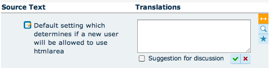
Additionally, if you click on the suggestion star, the original translation is hidden, so you cannot tell the difference between the two or more pieces of text. Clearly, both to handle existing suggestions and submit new ones, seeing the current translation with all the suggestions listed makes processing the community submissions much easier.
Rethinking the UI
Thankfully, several teams contributed such critical thinking to the localization server user interface and processes, but Konstatin Kaefer of the German team was the most outstanding in terms of user interface suggestions. Instead of minor reorganizations of the existing UI, he decided to tackle the core problem and bravely formed a new approach to text submission and moderation. Instead of inviting people to add and add and add new stuff, the rethought UI puts the existing submissions to the forefront, which helps think up truly valuable contributions instead of starting fresh. Not only that, suggesters and moderators are able to view live diffs of different suggestions submitted. The new user interface for the same language and string looks like this:
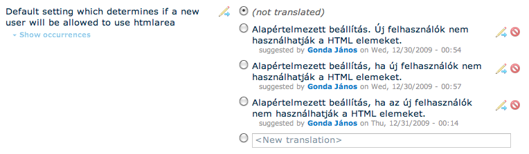
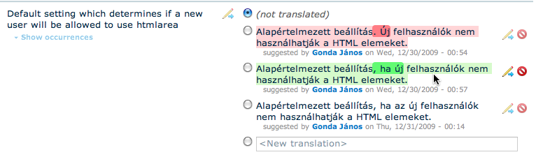
Even allowing you to compare and find those little differences (misspelling, style differences, etc) which would otherwise take more time to figure out:
What do the buttons do?
- The little pencil+arrow buttons open up the relevant text for editing in the "New translation" form field.
- Single clicking on an item (picking the appropriate radio button) will change the active translation to be that selected string (this will *not* mark any other suggestions declined, except the one you switched from).
- Double clicking on an item will change the active translation to be that selected string *and* will mark all other suggestions for the same English string declined.
- You can mark strings declined one-by-one with the red circle buttons.
- If a suggestion is marked declined with either of the above ways, you'll be able to re-activate it with a reverse arrow icon (until you submit the form, which saves your changes and will not show previously declined strings anymore).
- You can submit a suggestion by entering text in the "New translation field". If you also want to make it an active translation, you should switch the radio button to it. You'll see live diffs of the entered translation compared to the current translation (make sure you try this out).
- While user and time submission information is now printed inline (hover above the date to see how long ago that was), information on where things occur is still hidden by default. This can be a very long list of modules and releases, so you should click the "Show occurrences" link specifically to see that.
Unifying moderation, browsing and translation
Another issue with the current user interface was that the browse screen only listed active translations, hiding suggestions from unprivileged users. The moderation screen on the other hand used a very minimal feature set allowing to look up suggestions by all the criteria used on the translation page, but allowing for no comparison of the suggestions, or looking at which active translation they were for. The moderation screen only allowed search in the suggestions while the translation screen only allowed to search in the translations. You could not look for all strings with suggestions containing words your style guide will not allow. So another important effort here was to unify these three screens. And indeed, where there were Browse, Translate and Moderate screens before, we only have a single translate screen.
How does one screen solve the job of all these three existing ones? Well, you get different levels of features depending on your permissions, so if you do not have suggestion submission or moderation features, the translate screen will just degrade to a browse screen. You'll see all suggestions but will not be able to do anything when them. As your permissions widen, you get more and more features.
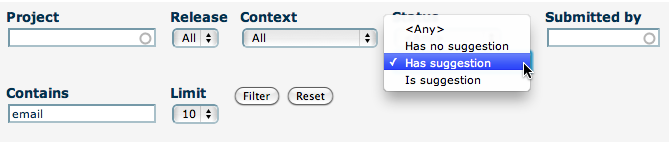
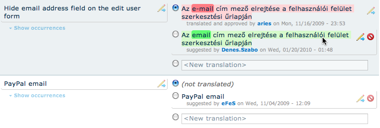
Supporting moderation gets us some exciting features. As I've said, the moderation screen basically had the same search filters as the translation screen, but it only searched in suggestions. So if we can make the translation interface search in suggestions optionally, we widen its feature set and also allow for the same filtering that the moderation screen had. Given that we show all translations and suggestions now, the search default also changed. Now all user and text searches will look at both translations and suggestions by default. If you'd only like to search in translations (as before), you can pick the "is translation" option from the status items. If you'd like to look in suggestions only (as on the previous moderation page), you can pick the "is suggestion" option:
Search results are emphasizing the actual matched strings with a subtle bezel around the matches. In this case I'm looking for "email". Both source strings matched, but of the three suggestions only two matched:
Test drive with us!
This is a pretty big user interface change, so we thought it would be best to give you a test drive and gather feedback before we roll it out on the live site. Please go ahead and try this out now! Just go to http://localize.staging.drupal.org, enter drupal/drupal for the HTTP authentication prompt when requested, log in with your drupal.org username and password and play around. This staging site is running on a copy of the live database, so whatever data you enter will not persist to the live site. We invite you to try this out, but let's not do anything you'd like to keep for the future. Have fun and provide us feedback! Thanks for your help.
Want to hear more?
Vote on the session about this service and developments in progress for Drupalcon San Francisco: http://sf2010.drupal.org/conference/sessions/bringing-drupal-all-worlds-...
Comments
does it will extend to
does it will extend to support CJK comparison ?
we have a few of those
We have a few CJK languages, so feel free to try and report bugs as you find them. I did not try yet to be honest, but absolutely intend to support.
Thank you, great post! Just
Thank you, great post! Just the information I needed to know
ingin hamil , kata kata lucu terbaru , kata kata mutiara kehidupan , kumpulan kata kata romantis , kata kata yang indah
great
I just loved shopping there for all kinds of great books. I miss the Bodhi Tree just like all of it's fans. Hoping for a return one day of the might Bodhi Tree. Please come back and share your amazing books with us again. I've had issues with hackers and I'm looking at alternatives for another platform. I would be fantastic
if you could point me in the direction of a good platform obat tradisional penurun asam urat thank you
The text comparison algorithm
The text comparison algorithm probably doesn't support CJK languages yet, mostly because I don't know these languages well enough to know how text should be compared for these languages.
Test Drive
Great improvements!
What I did not find intuitive:
- What is the difference between the pencil on the left and the one on the right side? Well found out the one on the left side can overwrite suggestions and may be only visible to Administrators. But still it should look different if it does something different.
- Diffing by hovering. While adding another button may be bad in terms of cluttering the interface, I would not have come to the thought that the red and green means marking the difference between translations. Have no idea for solution, but this struck me, as I only found out about the colors from this post.
- The filters are generally very useful, especially the status filters. But what is the difference between "has suggestion" and "is suggestion" ?
A general comment: I bow down into the dust in front of this project. This will hopefully help the distributed teams _a_lot_ to faster and better translate Drupal and all its project. Maybe Drupal will become the best translated CMS ever ;) no caucasian dialect will be unknown...
arrows, colors, filters
1. The pencils always belong to the text they are positioned with. Pencils in the left column let you copy and translate the source strings, pencils in the right column let you fine-tune text by starting with existing suggestions. I think this is more apparent when you have multiple suggestions, the pencil on the left is more visibly related to the source string. This icon is equivalent to the previous "iPad" :D icon that was on the left of all strings. Now it is on the right of all strings to group with the approval buttons.
2. In terms of diff colors, if you look at http://images.google.com/images?q=diff+tool you'll usually see green as the color for new stuff and red as the color for old stuff with prominent greens highlighting additions and prominent reds highlighting removal. I think this is pretty much based on existing metaphors, but I agree you might not have seen this metaphor if you were not yet exposed to diff tools :) How could we make this more easily understood?
3. Sit back and taste the "has suggestion" and "is suggestion" options a bit. Let's put into sentences: "I'm looking in/for stuff which *has* suggestions", "I'm looking in/for stuff which *are* suggestions". Basically, when you look at things that "have suggestions", you look at strings which have outstanding suggestions (looking at suggestions and their current translations). When you look for "is suggestions", you look at the suggestions only (not their current translations). Same options are available for "has translation" and "is translation". This difference might be subtle. Do you have a better idea on how can we express this difference?
So I just gave it a review by
So I just gave it a review by recording my initial impression with the system, its about 7 minutes long :
http://www.screencast.com/t/ZWM2ZDc3 - Part 1
http://www.screencast.com/t/MmQzY2IyMz - Part 2
I think its definitely great that you pulled it all into one screen however there are a couple confusion points still :
Its not clear how to edit a translation, I create a new revision - I get that. But I am not sure why I have to be burden with that in the UI text? Other then that, it took me a second to understand the difference between an old and a new version - what is the current in effect which I really care about.
Some suggestions would be :
- Go for operation text, or at least don't have two identical icons.
- The Source text icon, should say Translate this phrase or something similar - rather then editing a copy.
- The Translation icon, should just say edit.
- The radio shouldn't be disabled, I get when I leave it empty it gets no new translation but its wierd there is a radio that doesn't actually work, I will play around till it works
- Translation sub text, the part in very light gray is really important to me, can it be shorter more easily scannable?
- I am not sure how this scales, what if I have 4/5 translation suggestions?
- Occurrences is not really that help full.
first patch
The first patch to come out of your review is http://drupal.org/node/735218
second change
Second change is about tooltips and wording: http://drupal.org/node/727574#comment-2691836 Your feedback would be welcome.
third patch
Third patch to come out of the videos: http://drupal.org/node/737230
Access denies
I am logged in, but it won't let me download. :(
are you member of the group
Are you a member of the group you'd like to export .po files from?
Same here
I am logged in and I am a member of the German team but http://localize.staging.drupal.org/translate/languages/de/export and http://localize.staging.drupal.org/translate/languages/de/import give me the Access Denied page.
And testing is somehow boring without moderate permissions ;-). Maybe we should grant moderate permissions to anyone on the staging server .
Thank you so much for this revamped interface, Gábor, Konstantin and all involved. I think you did an awesome job on this.
Minor issues: All the information flashing when hovering the mouse cursor somewhere can be a bit confusing, but then, I'd rather have too much information than too few. And I would love to have a means of transferring a translation from one localization server to another without SQL access. Maybe the suggestions could be stored in comments in .po files, e.g.
# msgsugg "Foo"

# msgsugg "Bar"

#: modules/node/node.module:747;

msgid "Title"

msgstr "Titel"