Mark Boulton Design was selected to lead the drupal.org redesign efforts almost two years. While they went on dutifully with the process listening to feedback from the community and designing a modern home for all things Drupal(.org), and the deliverables were in on time, the actual implementation (which was on the drupal.org community in general) lagged behind a bit. I've personally been to multiple sprints where we established the base for the redesign infrastructure on many levels. The big problems are not around applying a different theme to the drupal.org site but reworking the structure and some sections for the redesign. The latest sprint which I was unfortunately unable to attend was in San Francisco, where in a surprising turn of events, it was set that drupal.org subsites should push forward with implementing the new theme and concepts even ahead of drupal.org. After all, we do not have big rearchitecture plans for these sites, so we can sidestep the biggest tasks which keep drupal.org behind. So came http://association.drupal.org/ up in the new theme shortly after. This got me inspired to get deep down into applying the theme to http://localize.drupal.org/ as well.
To see how far we are, I've put the new theme under localize.drupal.org for a test drive a few weeks ago, and it was not looking nice. Turned out that some developments pushed it away from the underlying navigation-sharing infrastructure we built earlier. So I worked on getting those advantages back and making all the shell of the theme work. Then came putting in the localization server pieces to the right places. This mostly involved making some obscure custom page elements actual blocks to put them into the right place with the new theme. I believe this helped push both the theme and the underlying navigation-sharing goodness to get into a better shape for use on other subsites in the hopefully not too far future.
Finally today was the day to finish it all up, fixing some odd issues and switch over to the new theme for your enjoyment. With this, we join the Drupal Association site in adapting the new theme and hope to provide you with an increasingly integrated experience as other subsites adopt the same theme and shared navigation structure.
Drupal.org redesign, here we come!
(Note that anonymous visitors might get half-baked cached pages while the caches are refilled with all the new pages. Let us know if/when you find issues with the new theme via the usual means.)
Comments
Awesome!! Thank you guys.
Awesome!! Thank you guys. We've been waiting for this for a long time :)
Keep up the good work
I love it,
Can't wait that also d.o gets the new skin!
PD. Screenshot of too wide input box. Maybe putting size value of that element to 30 -35 will look better
http://img195.imageshack.us/img195/9914/clipboard01gz.jpg
(Update) Wow, you removed it fast
font size smaller than before
font size smaller than before ?? can it increase 1px.
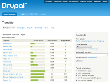
some groups have stats, and other have not ??
http://localize.drupal.org/translate/languages/it/translate?project=drupal
http://localize.drupal.org/translate/languages/ja/translate?project=drupal
is it cache problem ? (I'm loggined)
if it can increase table width would be more better
http://localize.drupal.org/translate/languages
stats, tables
1. Yes, the font is smaller and I agree that it would be better bigger. Given the shared look of the drupal.org sites, this is now a drupal.org-wide question and should be agreed on as such. I suggest you bring up this issue in that form on the drupal.org webmasters queue.
2. None of those pages should have stats. It might be a cache issue, yeah, seen similar issues elsewhere (see http://drupal.org/node/829290).
3. On the table size, its set at 45% of the page width, which we could bump up to 48% but above that it would wrap due to the margins on the tables. Its not much better IMHO at 48%. Do you think it is?
hope it can be more better
hope it can be more better then.
can L.D.O do it if durpal.org decline the suggestion? L.D.O should think more global than drupal.org. we have 70 languages here. Arabic, CJK ... with small font are hard to read.
now I work for 15min, my eye feel so tired. maybe small font & lighter color. anyone have same feeling ?
table width with 48% should be great. Thanks Gábor !!!
client zoom
Most browsers have excellent zoom features now to make the font size bigger. I'm using that to make it work better for me. I totally agree the font size would be better bigger, so let's continue at http://drupal.org/node/829944
On the original block strangeness issue you noticed, we debugged and resolved the issue at http://drupal.org/node/829290, it should not happen anymore.
Looking really good Gábor.
Looking really good Gábor. Have tested it and as far as I can see is there non big glitches in the interface.
Great work!
Cheers
@steinmb
Great work!
Great work Goba! Thanks!
(I agree that the font size is too small, so I posted an issue: http://drupal.org/node/829944)
Congratulations, it looks
Congratulations, it looks terrific.
Beautiful
The theme represents the real beauty of drupal. I hope that the main site will soon adapt to the new style, too. :)
Visual separation of comments
Like the new theme design very much.
Apart from the font size question already mentioned, I find that the comments "merge" together visually because there is no border on them or zebra-style background shading. Also the reply link and posted by info are not visually "connected" to their comment so it takes more concentration to see exactly what is what.
Anyone else got any thoughts on this?
Also having hit Preview I notice that the title I entered for this comment ("Visual separation of comments") is not being displayed anywhere .. I think..
[update: I notice that Mark Boulton uses a simple horizontal line to separate comments on his own blog, e.g. http://www.markboulton.co.uk/journal/comments/on-designers-writing-html ]
agreed
Agreed. It would be good to see this feedback in issues at http://drupal.org/project/bluecheese Thanks!